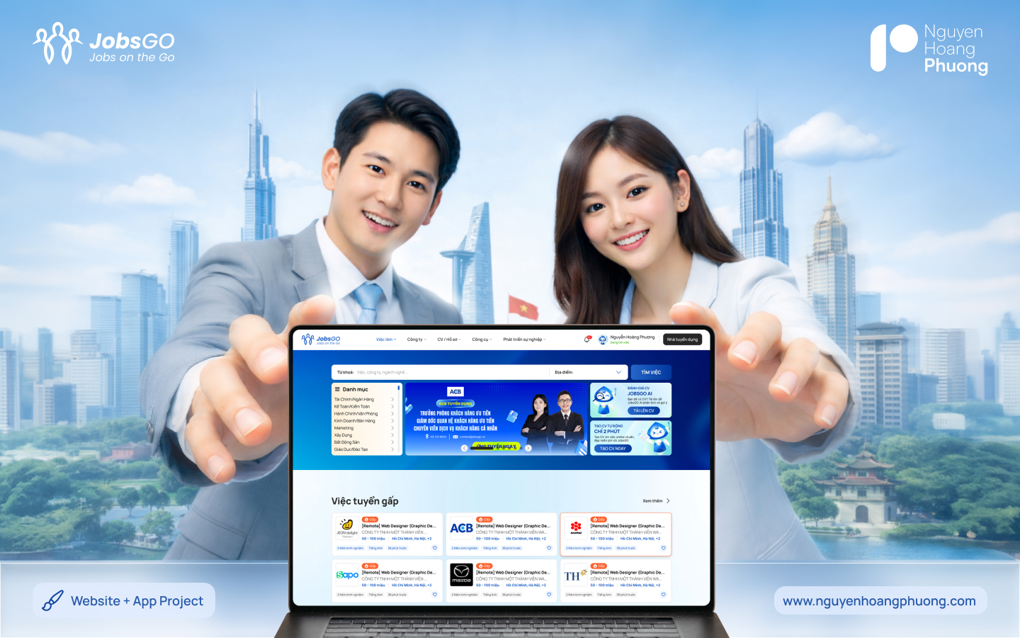
An end-to-end UX/UI redesign of a recruitment platform — making it faster and clearer to find, compare and apply to jobs, for both candidates and employers.
The existing platform packed too much onto every screen. Candidates struggled to scan results and understand each role, while the apply flow had unnecessary steps that hurt completion.
User interviews revealed that 70% of candidates abandoned the apply flow at step 3 — not because it was hard, but because they didn't know what documents were needed upfront. That single insight reshaped the entire apply flow.
dropped off at the document step — an avoidable, expectation problem.
candidates & employers needed very different flows from one product.
was too long to understand a job — cards needed the essentials up front.
Acting on that insight, I redesigned the apply flow to surface required documents upfront, turning a confusing multi-step form into a clear, guided journey. In parallel, I rebuilt the job card so candidates can judge a role at a glance.
From wireframes to a polished UI kit, every screen was designed to reduce friction and keep the next action obvious — with a consistent component set the team can extend without breaking the experience.
The biggest lever wasn't visual polish — it was removing uncertainty at the exact moment people hesitate. Designing for two very different users from a single product pushed me to make each flow feel effortless without splitting the experience in two.
Tell me about your idea and let's make something worth remembering.
info@nguyenhoangphuong.com ↗